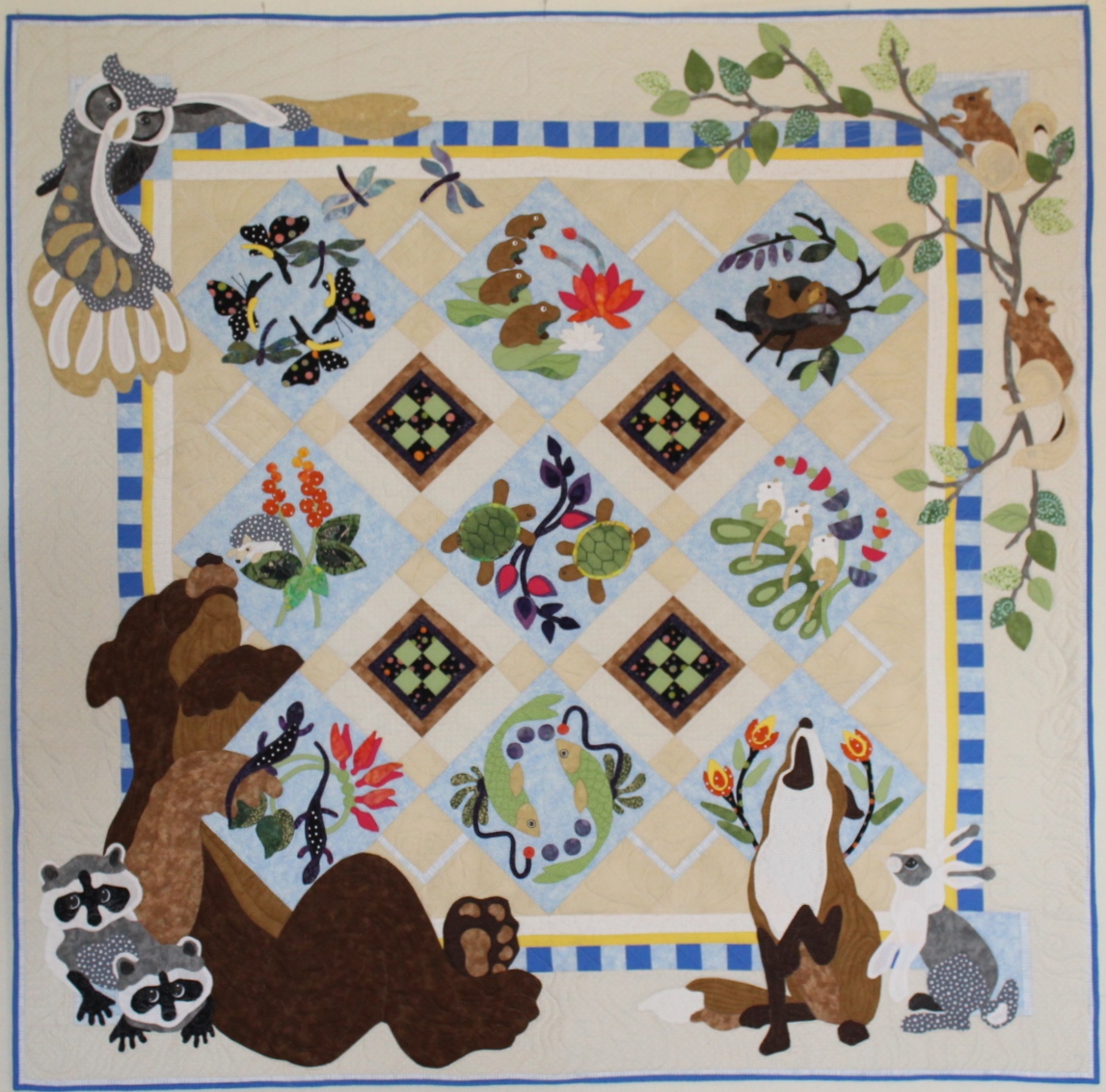
I loved this pattern from Java House Quilts the first time I saw it. If you love it as well, you can purchase it yourself here. I started working on this quilt back in September. The applique would be needle-turned, meaning by hand. The edges would be turned under and stitched down by hand vs fusing down a raw edge applique onto the background and machine finishing the edges (a tedious, but much quicker method). I figured it would take me about 2 years to finish; a nice project for me to work on in the evenings before bedtime. My daughter was going to start “trying” to get pregnant soon. Maybe this would make a nice baby quilt. If she never conceived, I could keep this quilt for myself (trying not to get my hopes up). Her older sister took several years of trying to conceive naturally and then several attempts of in vitro before getting pregnant. So, 2 years… I would have plenty of time to casually work on this quilt.
Then, in October, she told me she was pregnant. Or, was it late September? She was due June 2nd. I was shocked, floored. Surely, it was too soon to know for sure… a false positive… I admit it. One of my first thoughts was about this quilt. How on earth would I get it done in time? It has plenty of big pieces but also LOTS of tiny pieces. I figured I’d better get busy. As I got farther and farther into this quilt, I was kicking myself for not machine appliqueing it. It is what it is. And, I am done now. I’m late for the arrival, but I am done. He’s about a week old now and a cutie patooty!
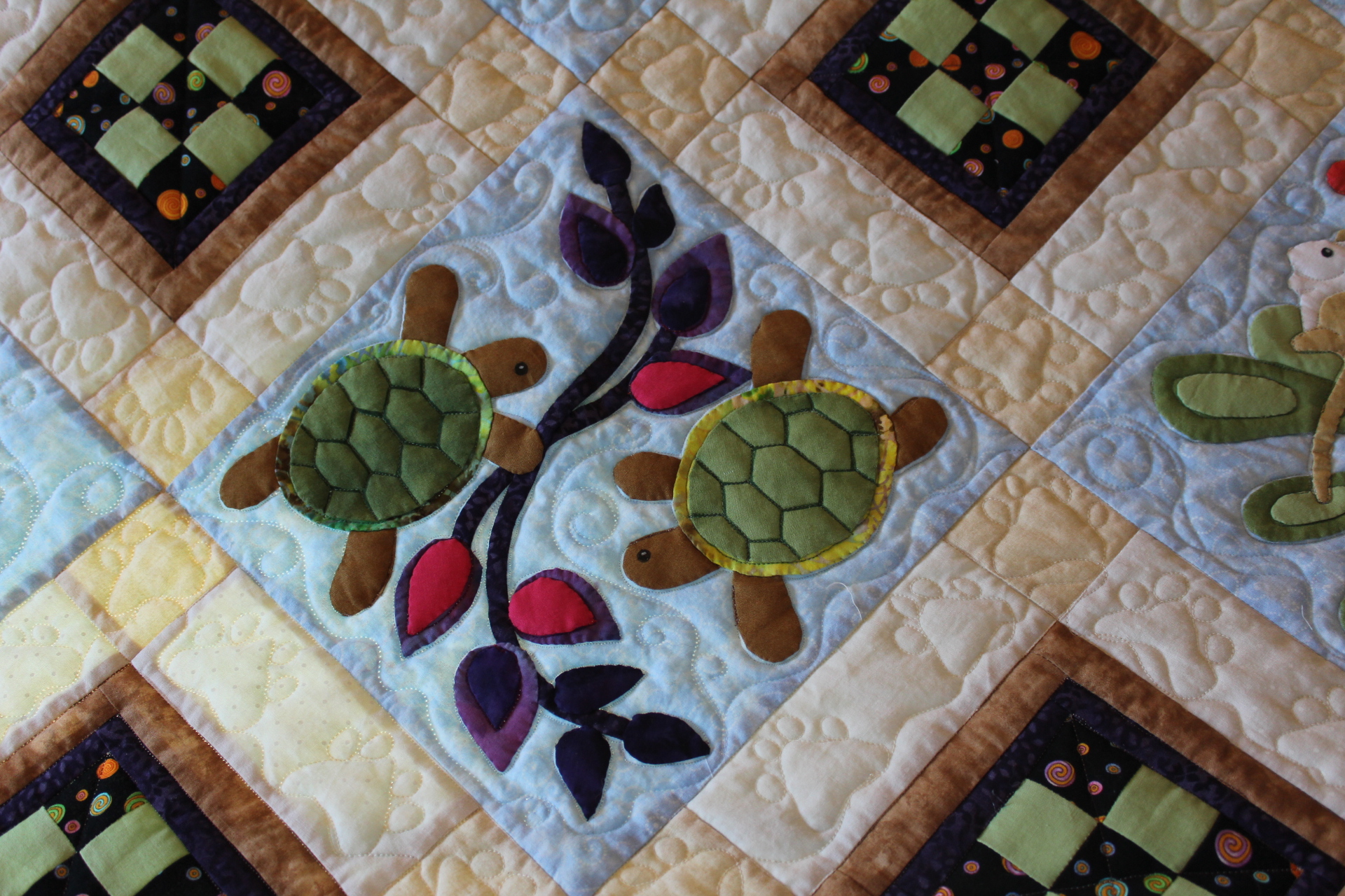
The question once I finished it was how to quilt it. The more quilting you do on a quilt, the more thread you add to that quilt and the heavier and stiffer it gets. This was for a baby, so I wanted it to be soft… or at least as soft as I could make it and still add details to it. You will notice there are plenty of gaps in the quilting where it seems like there should be more quilting. That was intentional to prevent the quilt from becoming too stiff and heavy. I stitched down enough to give the effect of what I wanted and then let the rest go. Sometimes you’ve just gotta “let it go.” 😉 My desired effect was playful, yet polished.
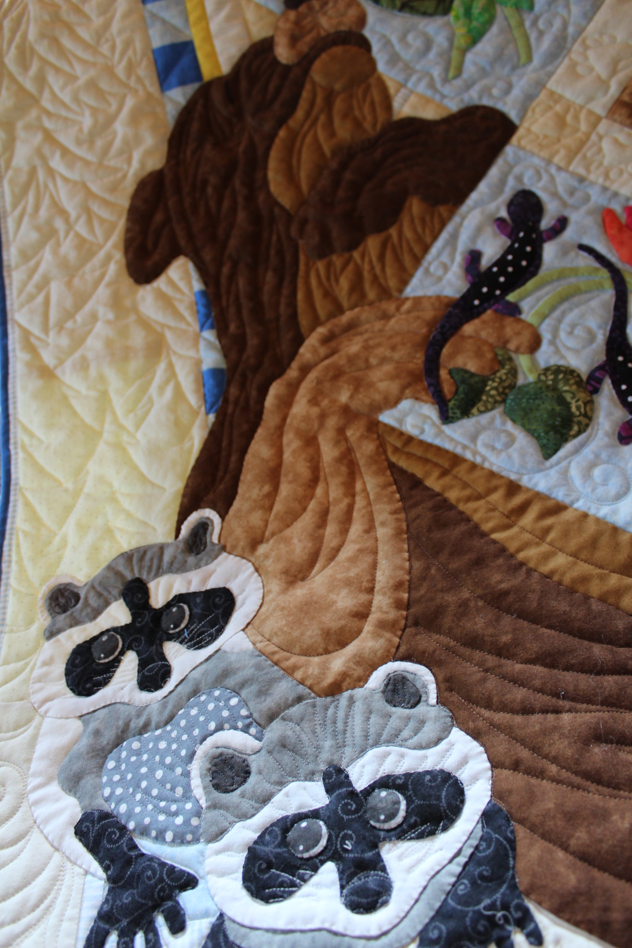
Simple swirls were stitched inside the appliqued blocks around the animals and flowers. My instinct was to put something formal on the outside edges of the pieced blocks, but I ended up putting animal paws there instead. They are not perfect, by any stretch of the imagination, but it’s okay (Let it go!). The way you make these animal paws is to stitch a curvy triangle with 2 ovals going up one side and 2 ovals going back down the other side, all as a continuous path with no starts and stops.
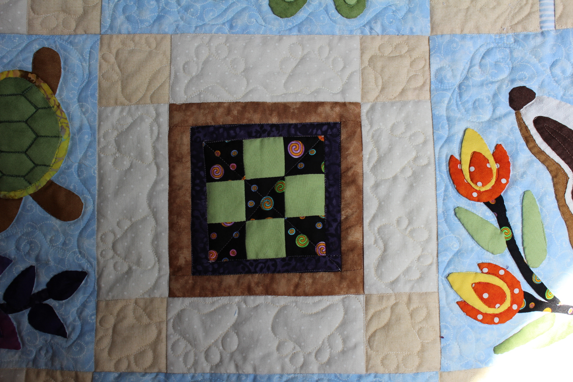
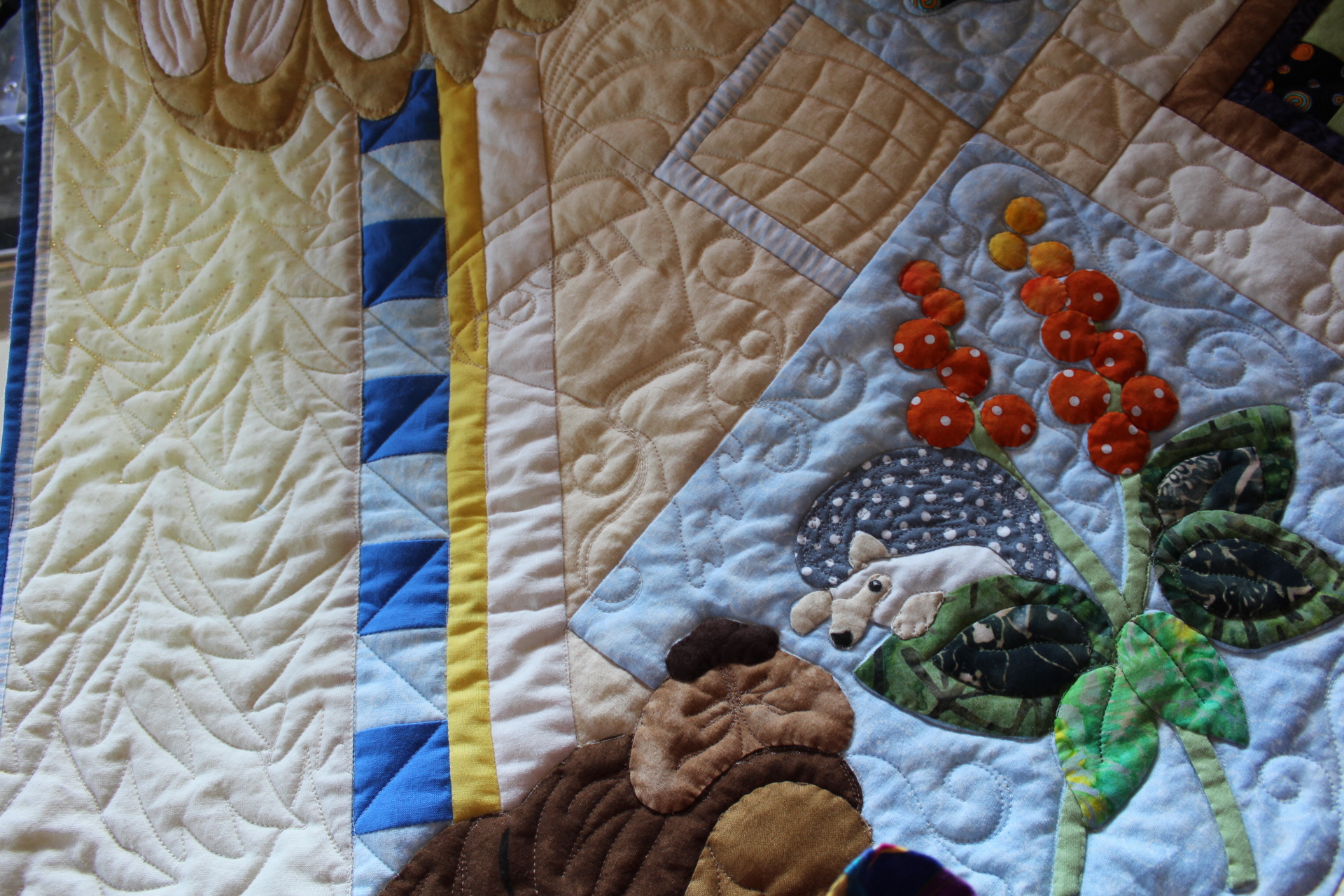
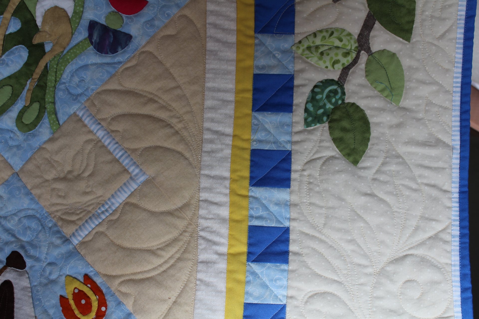
What should I do with those outside odd blocks along the border? I could have added nature scenes, but that would involve intense stitching. It needed to be open and flowing. So, I opted for something formal and polished in those areas; feathers and curved cross-hatching. Traditional feathers would be nice, but I chose bumpy ones to mimic butterfly wings.

I did sneak some playfulness into some of those areas.

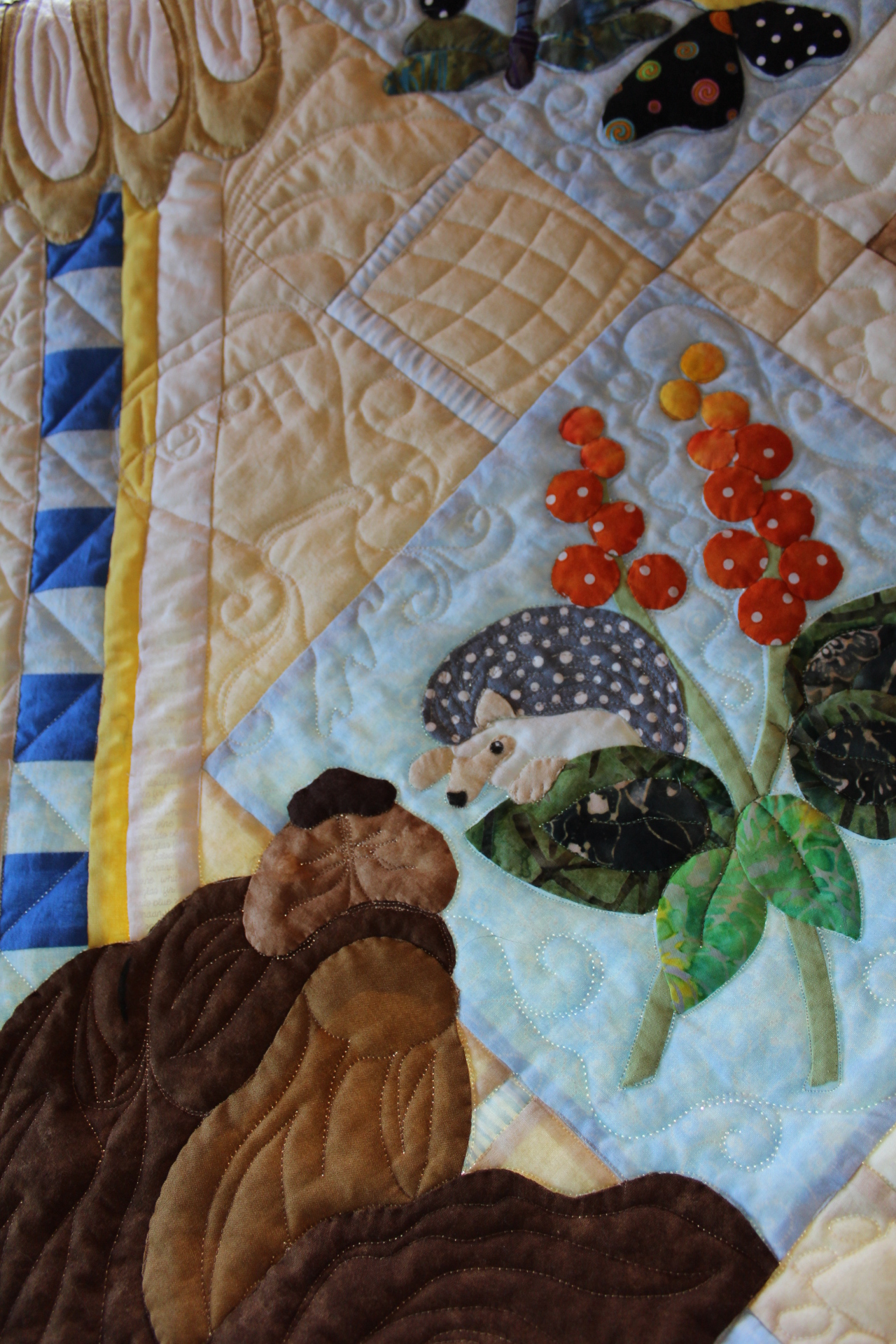
As for the borders, I started at the bottom and stitched a very loose fern to mimic a grassy look.
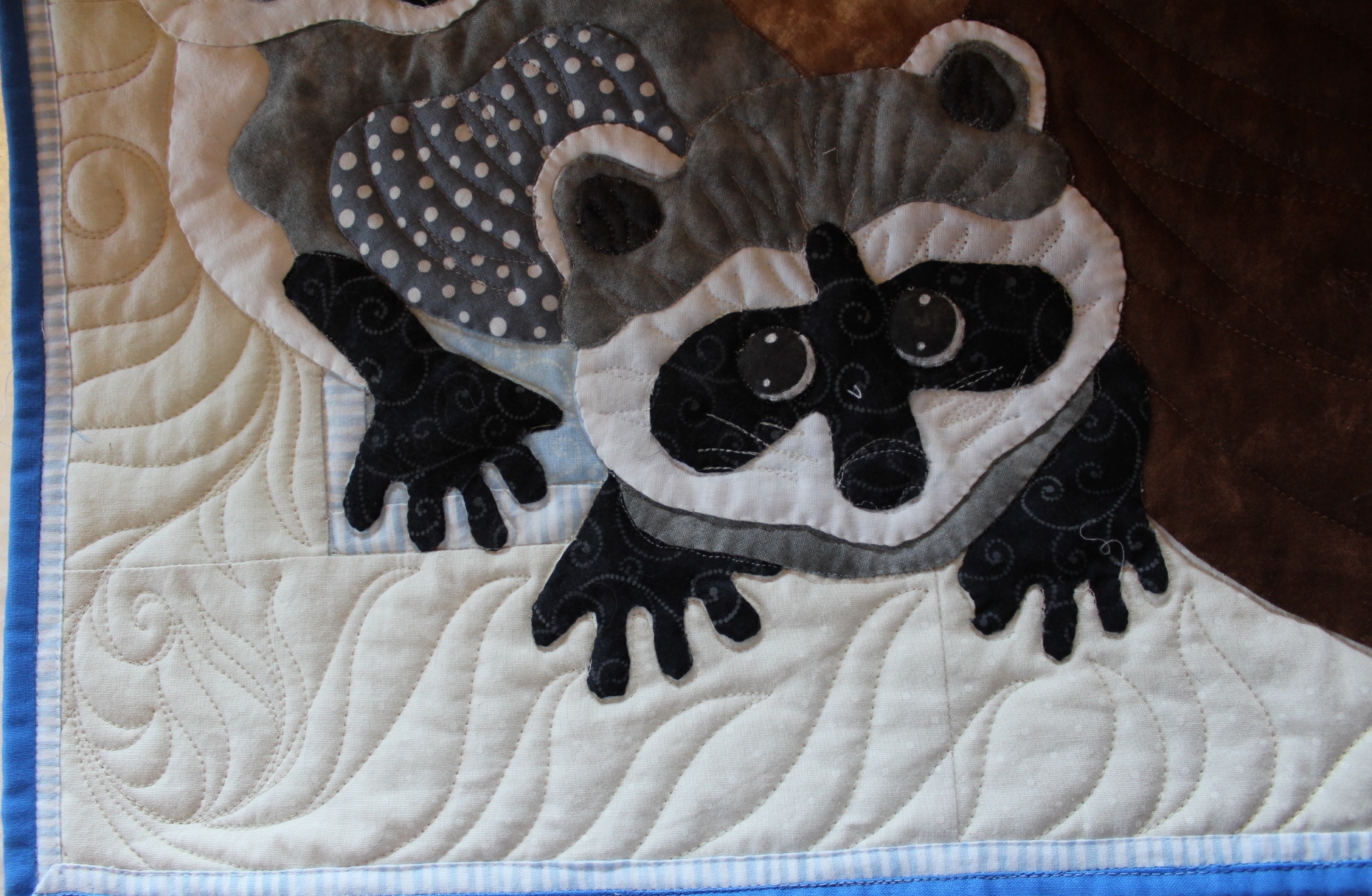

Moving up the sides, I stitched pine trees on the left by the raccoons and bear. My pine trees got worse as I stitched more and more of them (Let it go!) up towards the owl.
On the right, I transitioned the ferns into leafy vines to meet the squirrels at the top.

At the top I transitioned the leafy vines to meet the rays of whatever that circle thing is around the owl’s head. It could be the moon. Or, it could be the sun. Whatever your imagination sees is what it is.


A couple of notes… as far as the binding goes, I had a hard time deciding which fabric to choose. I finally decided that I wanted to see that darker blue repeated somewhere in the quilt. It’s one of my funny idiosyncrasies; I believe you need to repeat fabrics in a quilt to make it look more polished or professional. So, I chose that darker blue for the border and had intended to make a piping of the pale blue stripes that you see very little of in the quilt. The pale blue stripes are around the little square blocks where I stitched curved cross-hatching and also in the corners of the border. To get that effect, you create a faux piping within the binding. Here’s a tutorial by Margo Clabo from “The Quilt Show” of how to create that. For whatever reason, I decided I wanted to go with 1/4″ piping, so I cut my strips at 1 3/4 inch for the pale blue stripes and 1 1/4 inch for the solid blue – after stitching the strips together and then folding that wider pieced strip, I’d have a 1/4″ piping instead of 1/8″ inch piping. That was a mistake. It turned out to be a flange. There’s nothing wrong with a flange, but I was worried about it flapping around. So, I stitched it down. I’m okay with that. It still looks fine (Let it go!), and I still get to see both of those fabrics along the border.
Also, if you are wondering how I place appliques on their blocks, I draw out the original design onto a piece of plastic first. This particular piece is one of those pieces of plastic that hold papers together with a strip of hard colored plastic, while the clear plastic acts like a folder for the papers. I use a vis-a-vis marker which stays on there until I run water across it. I don’t know whether or not a dry erase marker would work. If you have tried that and it does, please speak up in the comments.

My goal is to teach you something new with my posts, if I can. So, I hope you learned something today!

Your Forest Galorest is AMAZING! I am going to dive into this adventure also. I would love to achieve the fun and softness like you did. Did you use batiks throughout the quilt? Did you use regular cotton fabric around the outside border or anywhere else?
thank you,
Lynnette Goldstein
LikeLiked by 1 person
Thank you, Lynnette!
Actually, I don’t think I used any batiks. Or, if I did, I used very few. Since it was for a baby, I wanted it to be as soft as could be, so I used quilt store quality fabric. The marbled fabrics you see (like the brown) are Moda Marbles. The outside border is not a batik, but a polka dot quilt store fabric.
LikeLike